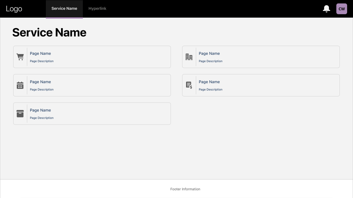
Overview
Consistency, accessibility, and delivery efficiency across the platform.
Led product design for confidential internal self-service journeys while creating and maintaining a reusable component library from scratch — improving consistency, accessibility, and delivery efficiency across the platform.
The Problem
Inconsistent UI and no shared components slowed down every team.
Internal services had grown organically — each team building their own patterns without a shared foundation. This created accessibility gaps, visual inconsistency, and slow delivery as designers recreated the same components repeatedly.
What I Did
Component library from scratch
Audited existing UI patterns across the platform, identified shared components, and built a Figma component library covering forms, navigation, data tables, modals, and notification patterns — all meeting WCAG AA standards.
Self-service journey design
Designed confidential internal self-service flows for staff-facing journeys. Ran workshops with stakeholders and service owners to map pain points, then prototyped and tested improved journeys iteratively.
Empathy Map
Getting inside the user's head first.
Before mapping the journey, I built an empathy map from interviews and observation — capturing what users say, think, do, and feel while completing a request. It surfaced the anxiety and uncertainty that the journey then needed to design away.
What are users saying about their needs or challenges?
What might the user be thinking but not saying out loud?
What actions or behaviours does the user take?
What emotions or feelings does the user experience?
Pains & Gains
What's getting in the way — and what would help.
I pulled the empathy map apart into the specific obstacles users face and the outcomes that matter most to them. This made the design priorities concrete: remove the pains, design for the gains.
What problems or obstacles are they facing?
What outcomes or benefits matter most to them?
Notes
Primary user: Administrator
- Responsible for managing requests on behalf of colleagues and teams
- Works in a fast-paced environment where accuracy is critical
- Needs to balance efficiency with risk management
- Values clear guidance, transparency and confidence throughout the process
- Key design principles: error prevention, accessibility, consistency and visibility of system status
- Opportunities include improving search and filtering, simplifying complex workflows, providing contextual guidance and making progress tracking more transparent
- Success is measured through reduced task completion times, fewer user errors, increased self-service adoption and improved user satisfaction
User Journey
Mapping the journey behind the request.
I mapped the user journey from entry point through task completion, including loops like saving progress, gathering missing information, and seeking approval. The highest friction appeared where users had to interpret policy-driven rules — so I designed for clarity and error recovery at each decision point — with both decision points looping back so users can recover instead of hitting a dead end.
Search for record
Users need to find the correct record quickly among large datasets.
Select record
Action-led design prevents users selecting ineligible records.
Review details
Users need confidence and clarity before making changes.
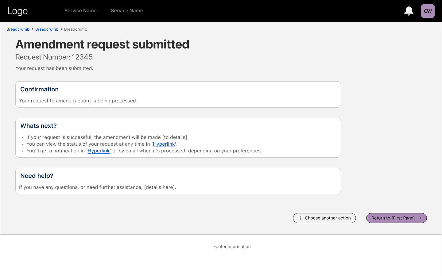
Confirmation
Clear success messaging reassures users the request was submitted.
Outcome