Overview
Making self-service feel natural, accessible, and easy to complete.
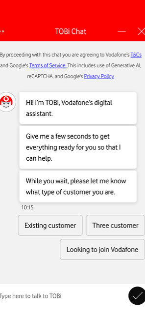
Designed Vodafone's virtual assistant experience — TOBi — across chat and voice to help customers solve common issues faster. Improved journeys, UI, and dialogue design so self-service replaced menus that sent customers in circles.
The Problem
Customers were looping through menus, not getting answers.
Vodafone's existing support journey was fragmented — customers bounced between FAQ pages, IVR menus, and agent handoffs without resolution. TOBi existed but felt robotic, frustrating users with dead-ends and unhelpful responses.
What I Did
Journey mapping & dialogue design
Mapped the most common support intents — billing queries, SIM issues, roaming problems — and redesigned the conversation flows to resolve them in fewer turns. Wrote dialogue that sounded human without sacrificing accuracy.
UI & interaction design
Designed the chat interface in Adobe XD — quick reply chips, carousel cards, form inputs within chat — so customers could act immediately rather than reading walls of text. Built hi-fi prototypes for usability testing.
Personas
Built around urgency and confidence, not demographics.
I created personas by clustering patterns from support intents and the way customers described their problems. The strongest split came from urgency and confidence — these shaped how TOBi handled language, confirmations, and fallback behaviour.
“Her data stopped working mid-shift and she's got customers waiting.” — Sarah, the urgent fixer
Contacts support when something breaks unexpectedly, usually during work hours when she can't afford downtime. Has tried the obvious fixes already (restart, airplane mode) but needs it working now.
Behaviours
- Scans for the fastest path to resolution
- Skips explanations, wants action
- Checks phone repeatedly during wait times
Frustrations
- Being asked to try things she's already done
- Multiple confirmation steps when she's stressed
- Not knowing how long this will take
Goals
- Get back online in under 5 minutes
- Know if this needs escalation or a quick fix
- Avoid repeating herself if transferred
Needs from TOBi
- Immediate acknowledgment of urgency
- Skip diagnostics she's clearly tried
- Fast handoff to a human if automation can't fix it
“Wants to make the right choice, not the fastest one.” — Linda, the careful decider
Contacts support to explore options before committing: comparing plans, understanding charges, checking coverage. Willing to read details if they're relevant. Values feeling informed over saving time.
Behaviours
- Asks follow-up questions before deciding
- Reads confirmation messages fully
- Compares options side-by-side, takes screenshots
Frustrations
- Being pushed to decide before she's ready
- Vague answers that raise more questions
- Feeling like the assistant is rushing her
Goals
- Understand what she's paying for
- Avoid surprises on her next bill
- Feel confident she made the right call
Needs from TOBi
- Patient tone, no pressure to choose quickly
- Clear breakdowns of costs and tradeoffs
- Confirm understanding before executing changes
“Knows exactly what he wants, just needs the system to cooperate.” — James, the power user
Reaches out with specific requests: change plan, update payment method, adjust settings. Comfortable with tech and self-service. Gets frustrated when simple tasks require unnecessary friction.
Behaviours
- Types direct commands (“upgrade my plan”)
- Closes prompts that feel like upsells
- Abandons the flow if it takes more than 3 steps
Frustrations
- Being asked obvious verification questions
- Suggestions for things he didn't ask about
- Processes that could be one click but aren't
Goals
- Complete the task without talking to anyone
- Do it faster than navigating the app menus
- Get confirmation it worked immediately
Needs from TOBi
- Recognise intent from the first message
- Minimal confirmations, maximum trust
- No handholding unless he asks for it
User Journey
Mapping how customers move through TOBi.
I mapped the end-to-end journey to understand and resolve unexpected billing issues — from first notification through to advocacy — and to find the moments where conversational design could replace confusing menus.
Awareness
- Receives a bill notification
- Notices an unexpected charge
- Unsure why the bill is higher
- Wants a quick explanation
Consideration
- Opens the Vodafone app
- Considers calling support
- Chooses TOBi instead
- Expects a faster resolution
Engagement
- Opens TOBi
- Explains the issue in their own words
- Expects TOBi to understand intent
- Wants to avoid menus
Resolution
- TOBi identifies the issue
- Provides relevant explanations
- Asks only necessary questions
- Presents clear next actions
Retention
- Understands the charge
- Completes any resolved action
- Receives confirmation
- Leaves feeling resolved
Advocacy
- Positive self-service experience
- More likely to use TOBi again
- Less likely to call support
- More confidence in Vodafone digital
Outcome